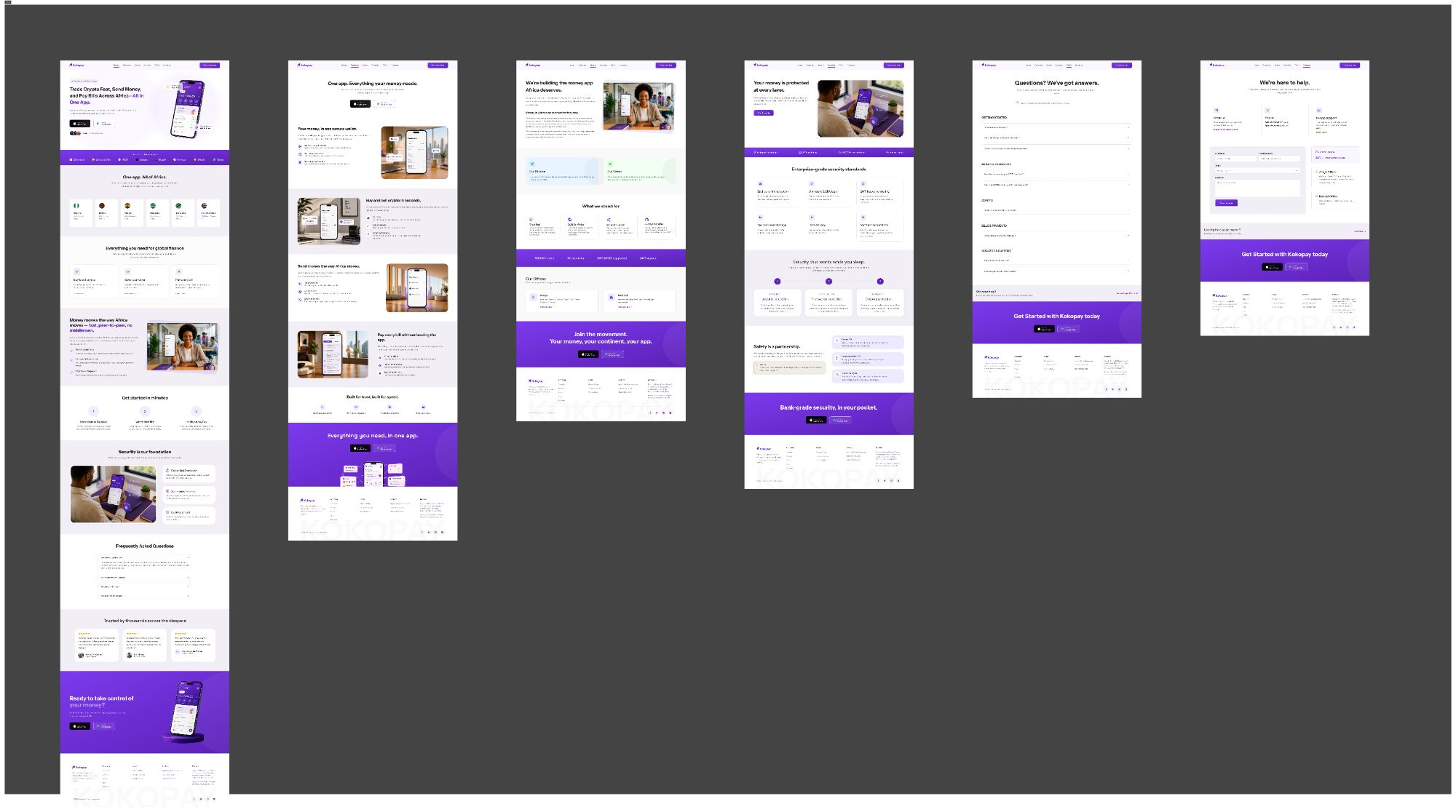
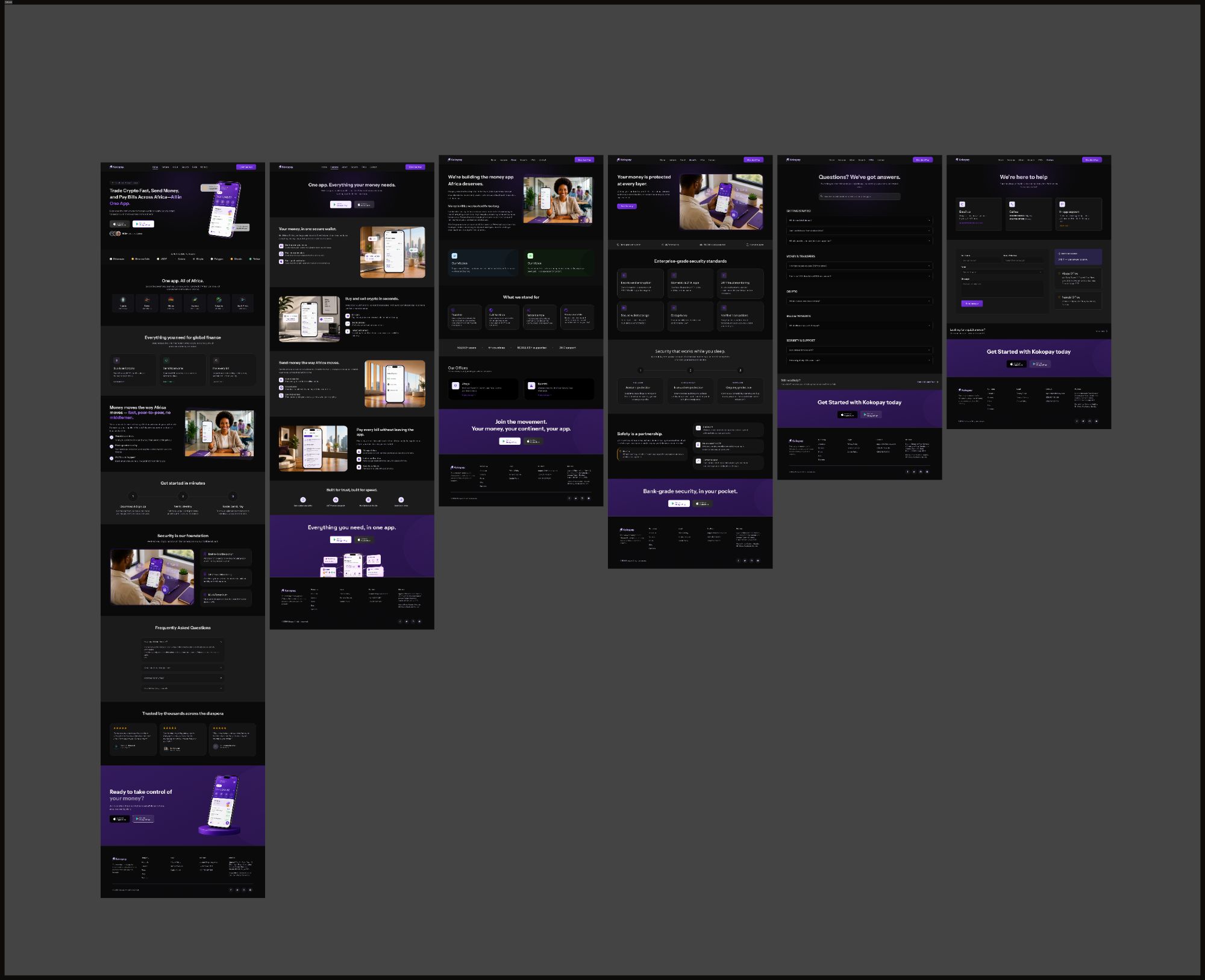
Kokopay · Overview + 6 screens
Paid Client Work · Website Redesign
Creating clearer fintech marketing experiences
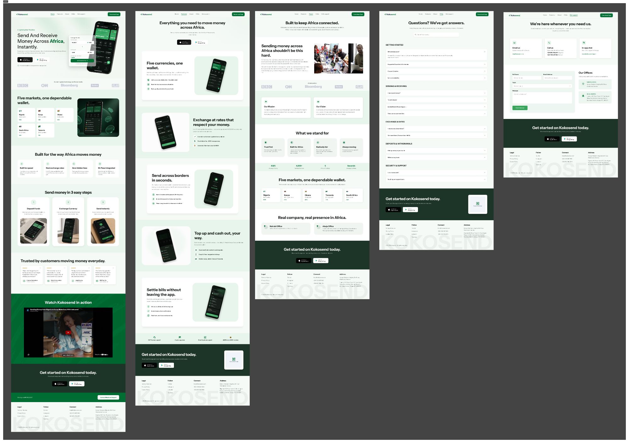
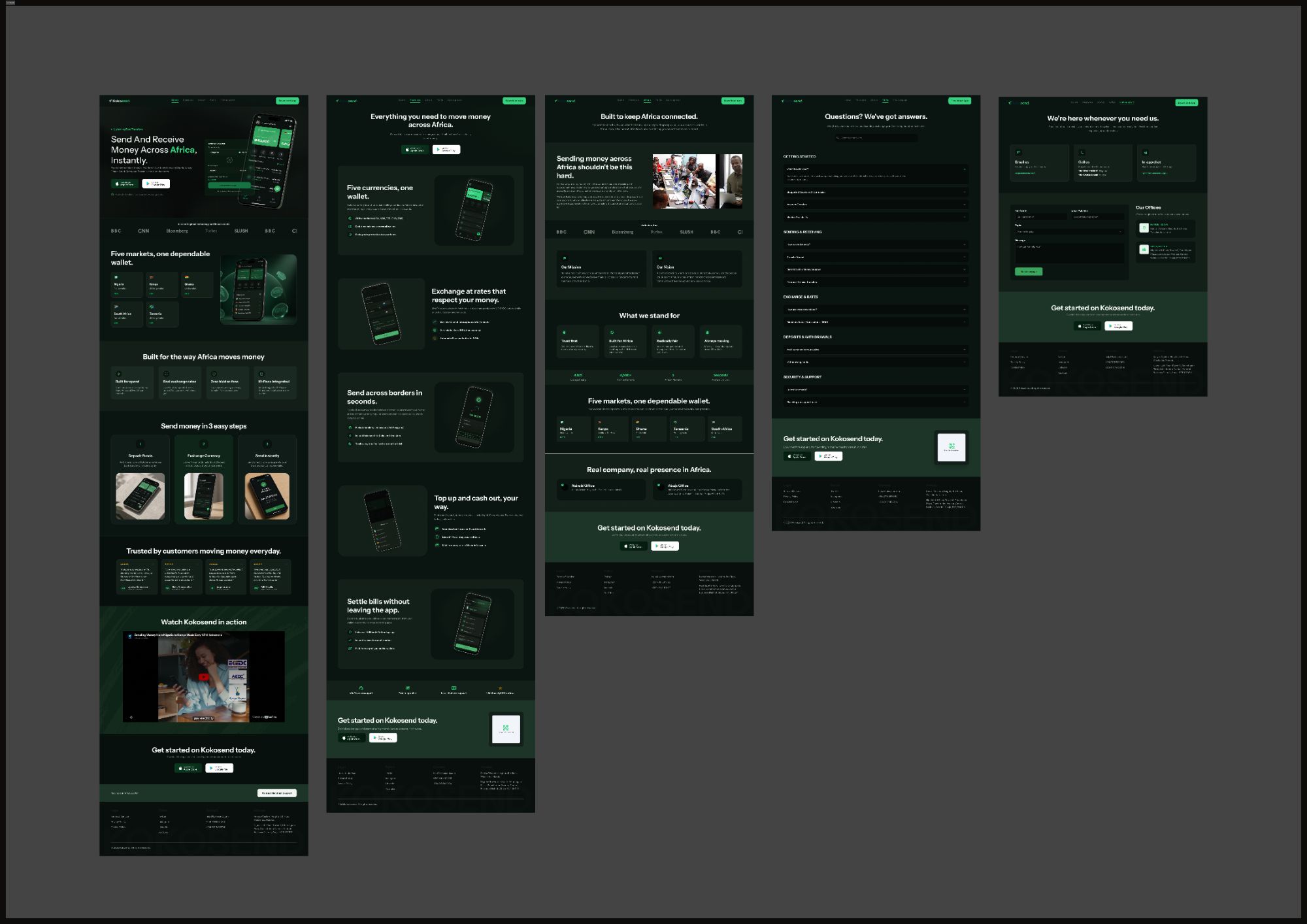
Two conversion-focused desktop website redesigns for the same fintech client: Kokopay, a multi-currency crypto and payments wallet, and Kokosend, a cross-border money-transfer app serving five African markets.
Role
Sole UI/UX Designer
Timeline
~5 days per website
Platform
Desktop websites
Type
Paid redesign
Context
The same fintech client commissioned two separate desktop website redesigns. Each site was scoped and delivered in roughly five days, desktop layouts only; mobile and responsive versions were not part of the engagement.
Design decisions
Distinct colour identities, shared structure
Kokopay uses a confident purple and Kokosend a fresh green, so the two products stay visually distinct despite a shared IA pattern.
Feature-first hero sections
Both homepages open with the core value proposition and a live product visual rather than abstract brand messaging.
Consistent three-step "how it works"
Each site breaks its core action into three numbered steps, reducing perceived complexity for a financial product.
Dark mode as brand-consistent, not an afterthought
Rather than inverting colours, each dark mode keeps its brand accent legible against near-black surfaces.