Social Commerce · Product UX · Client Project (anonymized)
Formalizing referral selling for African makers
A vendor dashboard for a multi-vendor social-commerce platform, turning the informal referral selling makers already do into a tracked, fairly-paid ambassador model.
Role
Product Designer, Vendor Experience
Platform
Vendor-facing web app
Engagement
Freelance client project (shown anonymized)
Tools
Figma
The problem
Small African makers already sell through referral: friends, resellers, and social networks moving product on their behalf. But that selling is informal. There's no way to track who actually drove a sale, no structured way to pay the people doing the selling, and no back-office tying a maker's storefront, orders, and sellers together.
The brief was to formalize it: give makers a real storefront and dashboard, and turn their informal resellers into tracked "ambassadors" who earn commission on what they sell.
The design problem underneath: how do you make a referral marketplace feel fair and transparent to two people at once: the vendor protecting their margin, and the ambassador who wants to see their work turn into money?
Research & the two users
I ran qualitative interviews with five people close to the problem: three vendors and two ambassadors. Two findings each overturned an assumption I'd started with: one reshaped the architecture, the other reshaped the payment model.
The vendor
A maker running their own storefront, managing products, orders, and payouts.
The ambassador
A referral seller who promotes a vendor's products and earns commission.
Their incentives pull in opposite directions, which is what made the commission experience a genuine design problem rather than a simple feature.
Finding 1
Finding 2
The design challenges
Three questions, grounded in what users told me, shaped the work:
- How do you make a commission split feel fair and transparent to the vendor and the ambassador at the same time?
- How do you architect for a vendor who owns more than one storefront and wants them kept separate?
- How do you keep a data-dense dashboard action-first, so it tells the vendor what to do next rather than just what already happened?
Key decisions
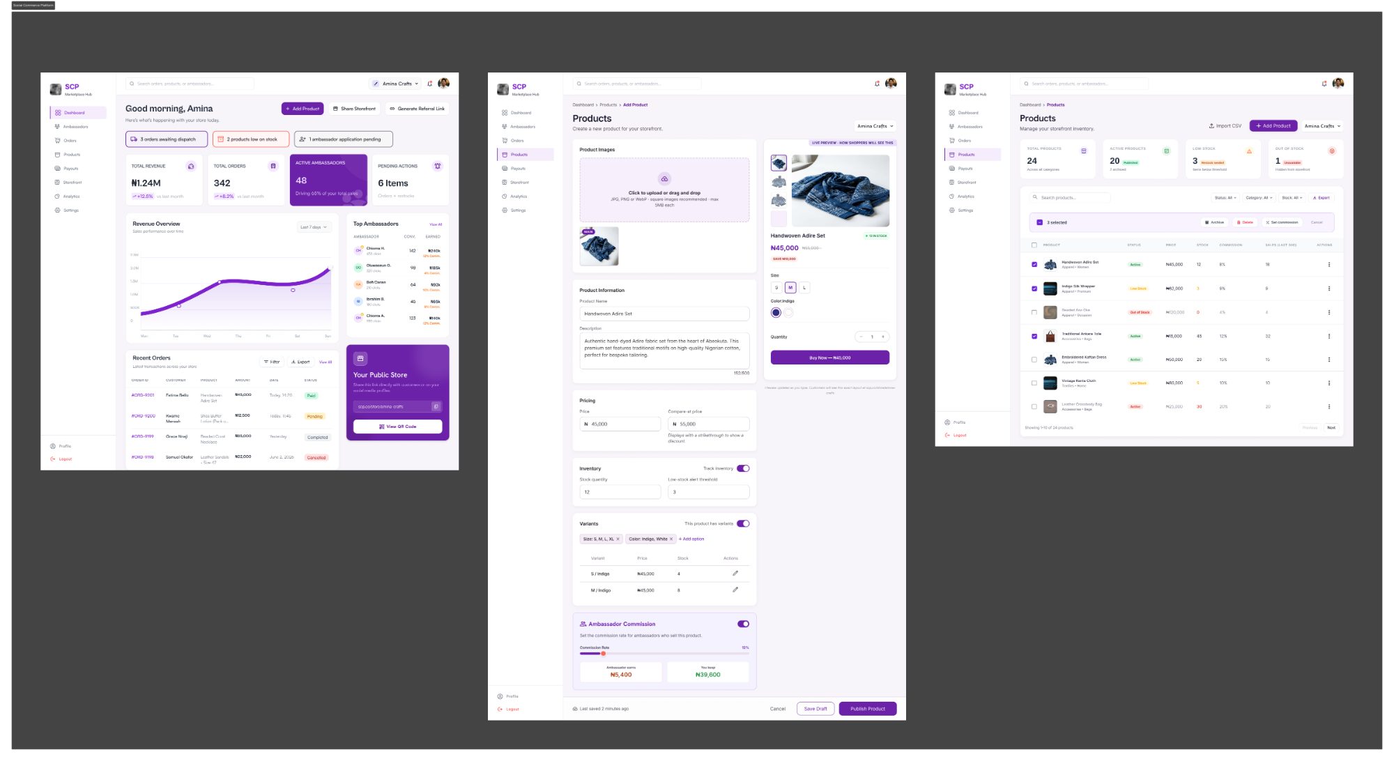
Store switcher on every screen
Multi-store ownership is architectural, not a setting. It is present from the first screen, isolating orders and storefront identity per business.
Live commission split at creation time
When a vendor adds a product, they see the split before publishing: what the ambassador earns and what the vendor keeps.
Live product preview
On the Add Product screen, the vendor sees exactly how shoppers will see the listing as they type, removing uncertainty at the highest-anxiety moment.
Action-first dashboard
Distinct inventory states (low stock, out of stock) and a "Pending Actions" summary orient the vendor around what needs doing, not vanity metrics.
Designing for trust
Trust wasn't left to emerge on its own. It was designed at specific moments:
- •Commission transparency: both the vendor and the ambassador can see how a sale splits, so the arrangement never feels hidden.
- •A shareable public storefront: a direct store link and QR code let vendors sell through the social channels they already use.
- •Order clarity: order status is always legible, so vendors and buyers know where a sale stands.
Collaboration & scope
I worked as part of a two-person design team and owned the vendor-facing experience shown here; another designer worked on the administrative platform. The client changed the product's design direction after my engagement ended, so these designs are not the current live product.
Visual system
A deep purple primary with a coral secondary keeps the interface confident but calm under dense data. Every monetary value is in Naira. Product content reflects real African maker categories (handwoven Adire, Aso Oke, Kente, Ankara), so the platform reads as authentically built for its market rather than a generic template.
Final screens
Vendor dashboard, Add Product screen, and Products/Inventory screen.